
A buyer opens your pricing page and finds three plans. The numbers look clear. The decision does not. They cannot tell whether their team needs the middle plan, what happens when usage grows, or whether the trial needs a credit card.
A SaaS pricing page audit checks whether your page helps buyers understand value, compare plans, estimate costs, resolve doubts, and take the right next step.
Use these seven checks to find missing answers. Then use the ten-minute review to choose your first three fixes.
Why a pricing page is a sales page, not just a rate card
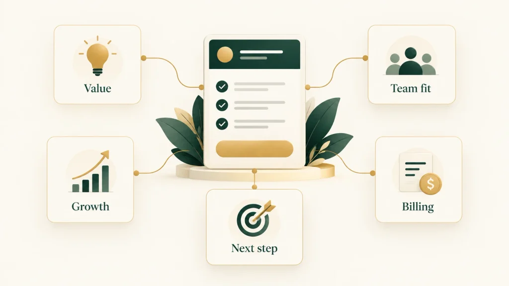
A pricing page is a sales page because it connects a product’s offer to a buyer’s decision. The price matters, but so do the plan fit, included features, billing terms, limits, proof, and next step. A useful page explains enough for the buyer to decide whether to continue.
Your buyer may be asking five questions:
- Is this product worth the cost for our use case?
- Which plan fits our team today?
- What happens as our team grows?
- What will we pay beyond the headline price?
- Can we take the next step confidently?
A self-serve product should help buyers choose a plan and start without needing a call for basic billing answers. An enterprise product may need a sales conversation about security, rollout, or contract terms. Its page should still explain who the offer suits and what shapes the quote.
This review concerns how you explain an existing offer. If the package itself does not fit customer needs, clearer copy cannot solve that underlying problem.
The seven-point SaaS pricing page audit checklist

A SaaS pricing page audit should check seven decisions: value, growth, objections, the next action, supporting proof, the current alternative, and mobile use. For each one, record the wording or missing answer that affects a buyer’s choice. Turn that observation into a specific edit, then verify the edit against your actual product and terms.
1. Value anchor: connect the price to a useful outcome
Buyers need to understand what the plan helps them do. A list of capabilities does not always explain why those capabilities matter to their work.
Check the sentence above your plans and the short description inside each card. Does either name a useful task, the right team, or a clear reason to choose that plan?
A common problem is copy such as “Advanced workflows, dashboards, and integrations.” It describes categories, but leaves the buyer to work out the value.
Illustrative before: “Pro: advanced workflow automation.”
Illustrative after: “Pro: route incoming requests to the right owner and track work across teams.”
The revision explains what the capability does. Use it only if the product supports that workflow. You do not need to add a time-saving number to make the value concrete.
For a complex product, name the main use case and link to deeper detail. My self-led feature-page rewrite shows how a specific buyer task can lead an opening.
2. The plan-outgrow answer: explain limits and growth costs
Buyers need to know what changes when they add users, handle more work, or need stronger controls. Your B2B SaaS pricing page should make the current fit and the next upgrade understandable.
Check the billing unit first. A seat usually means a licensed user, but products may treat guests, administrators, or inactive accounts differently. Define your own rules.
Then check included usage, reset periods, extra charges, minimum commitments, and upgrade triggers. “Unlimited” needs a clear scope if other limits still apply.
Illustrative before: “Growth: $20/user/month.”
Illustrative after: “Growth: $20 per paid seat per month, billed annually. Five-seat minimum. Annual subscription total starts at $1,200.”
That example uses fictional terms. It shows why the monthly equivalent and actual payment commitment belong together. State any applicable taxes or mandatory fees separately and clearly.
Notion’s pricing FAQ explains paid seats, membership changes, and upgrade or downgrade timing. It provides a useful example of answering growth questions with specific billing rules rather than a broad promise of flexibility.
For usage-based products, show what counts toward usage and what happens at the limit. For custom plans, explain the factors that affect the quote, even when a fixed public price would be misleading.
3. FAQ objections: answer questions that delay a decision
Buyers need answers about commitment, access, and risk before they start. A pricing page FAQ should address the questions that affect choosing or buying a plan.
Check sales emails, support conversations, and demo notes for repeated questions. Confirm the answers with the teams responsible for billing and product behavior.
A common problem is a generic company FAQ that leaves purchase terms unclear.
Illustrative before: “Can I cancel? Yes, anytime.”
Illustrative after: “You can turn off renewal in Billing. Your plan stays active until the end of the paid period. See the refund policy for eligibility.”
Use that revision only if it matches the actual terms. Cancellation and refunds are separate questions, so do not imply that ending renewal guarantees money back.
Put essential commitment details near the plan or button. Use the FAQ to expand them. A buyer should not need to open several answers to discover a required annual payment or setup fee.
For enterprise buyers, implementation, invoicing, security review, and contract length may deserve more attention than a self-serve trial question.
4. Clear next step: say what happens after the click
Buyers need to know whether a button starts a trial, opens checkout, or requests a conversation. Check both the label and the page it opens.
A common problem is “Get started” on every plan, even when one leads to signup and another leads to sales. The same words hide different commitments.
Illustrative before: “Get started.”
Illustrative after: “Start your 14-day trial.” Below it: “No credit card required. Choose a paid plan when the trial ends.”
Replace these fictional terms with your actual trial rules. Disclose any automatic paid subscription before signup.
For a sales-led offer, use “Request a pricing conversation” or another accurate label. Explain whether the buyer will book a meeting immediately or submit a form for follow-up.
Follow the path yourself. Does signup retain the selected plan and billing period? Does checkout show the same terms? Does the sales form ask for information relevant to a quote?
SaaS pricing page optimization includes this handoff. Clear page copy is incomplete if the next screen changes the offer or leaves the buyer uncertain.
5. Proof and social signals: support the offer with relevant evidence
Buyers need a reason to believe the claims that matter to their decision. Check whether your evidence supports a specific statement and suits the intended customer.
A common problem is a wall of logos beneath a claim such as “Effortless implementation.” The logos may identify customers, but they do not establish how implementation works.
Improve the section with a verified customer example, a product demonstration, or a clear explanation of the setup process. Place it near the claim it supports.
Illustrative before: “Built for complex approval workflows.”
Illustrative after: “See how request routing and approval steps work in this product walkthrough.”
A demonstration shows product behavior; a customer story can show how a particular team used it.
Use customer quotes with permission and enough context to identify their relevance. Do not invent testimonials or treat certification badges as proof of business outcomes.
If you lack customer case studies, show accurate product evidence and state any limits. Early-stage teams can explain their offer honestly without implying a track record they do not have.
6. Comparison with doing nothing: explain the current-process tradeoff
Buyers need to judge whether changing tools is worth the effort. Their alternative may be a spreadsheet, email, several disconnected tools, or their current vendor.
Check whether the page names a workflow problem and explains how the product addresses it.
A common problem is “Save thousands every month” without evidence or a clear calculation. It asks buyers to accept an outcome the page cannot support.
Illustrative before: “Stop wasting money on manual work.”
Illustrative after: “If requests arrive through email and spreadsheets, this plan puts intake, ownership, and status in one shared queue.”
That comparison gives the buyer a concrete change to assess during a trial or demonstration.
A small team with a simple process may reasonably keep its current setup. State where the product becomes useful, such as when handoffs span several teams or requests are difficult to track.
For a more detailed comparison format, see my Notion vs Asana portfolio sample. Keep the pricing page focused on the most important tradeoff and link elsewhere for deeper evaluation.
7. Mobile clarity: keep the plan decision usable on a small screen
Buyers need to read prices, compare differences, and act without losing context. Check your live page on a phone, including the billing control, FAQ, comparison table, and buttons.
A common problem is stacked plan cards that put terms several screens below the price. Another is a wide table where the plan name disappears as the buyer scrolls sideways.
Keep each price, billing label, key limit, and action together. Repeat essential terms where the layout separates them. Use short feature groups and clear labels for expandable sections.
Illustrative before: A card shows “$20” while “per seat, billed annually” appears only beneath the full comparison table.
Illustrative after: The card shows “$20 per seat/month, billed annually” beside its button, with the minimum commitment directly below.
Check touch controls, text size, and whether overlays cover important information.
There is no single mobile layout that suits every product. The test is whether a buyer can identify a fitting plan and explain the commitment without switching devices or guessing.
A pricing-page audit walkthrough
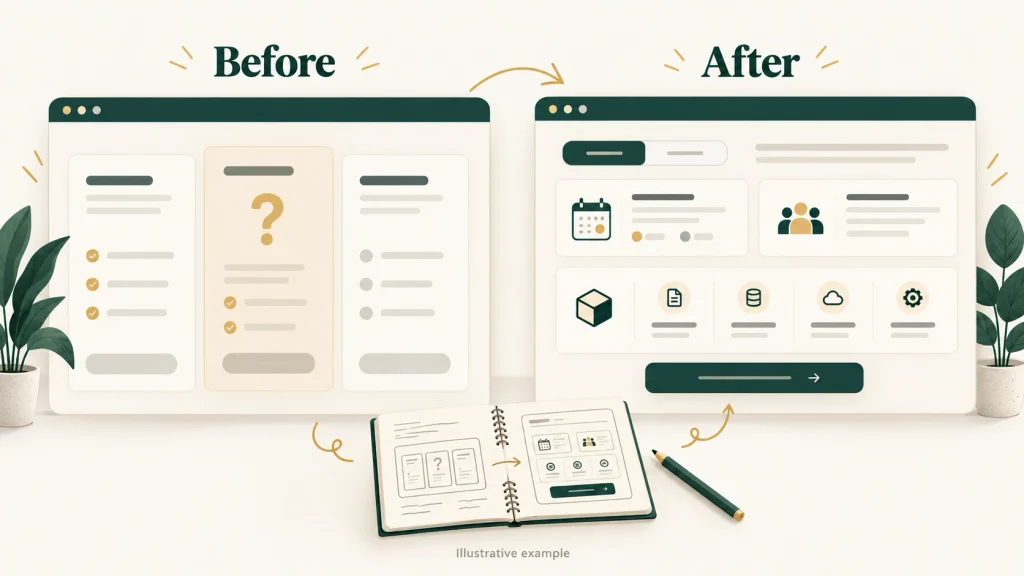
This hypothetical SaaS pricing page audit shows how to move from a page observation to a copy recommendation. The product is an unnamed fictional request-management tool. Its features and terms are invented for this example. The revisions illustrate clearer explanations; they are not findings from a client project or measured performance results.
Assume its Growth plan includes five seats, shared request routing, and 1,000 requests per month. The fictional monthly price is $99, and exceeding the request allowance requires an upgrade before more requests can be added.
The page currently displays “Growth: $99/month,” “Advanced automation,” and “Get started.” It also says “Flexible plans” without explaining limits.
| Original wording or problem | Unanswered buyer question | Proposed revision | Why it helps the decision |
|---|---|---|---|
| “Advanced automation” | What work does it handle? | “Route incoming requests to owners and track status in one shared queue.” | Names a task the buyer can evaluate. |
| “$99/month” | What does that price include? | “$99 per workspace/month, billed monthly. Includes five seats and 1,000 requests each month.” | Defines the unit, period, and allowance. |
| “Flexible plans” | What happens at the limit? | “At 1,000 requests, upgrade before adding more. Existing requests remain available.” | Explains the boundary and next action. |
| “Get started” | Am I paying or trying? | “Choose Growth and continue to checkout.” | Matches the action to the assumed purchase path. |
Before implementing these edits, the product and billing teams would need to confirm every term. The upgrade explanation needs particular care: a limit that pauses new work is different from automatic extra charges.
Then ask target buyers to choose a plan for a sample team and explain the bill. Record where they hesitate or misread the offer.
If the page goes live, monitor suitable next steps, such as checkout completion or qualified enquiries. Compare like-for-like periods and account for traffic or offer changes. A rise in button clicks alone does not prove better buying decisions or more completed purchases.
Common pricing-page questions worth answering
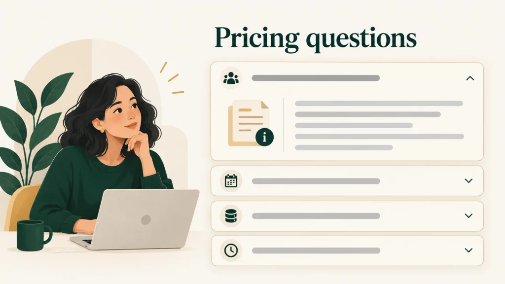
Pricing-page questions should explain plan fit, total cost, commitment, and what happens after purchase. Choose questions from real buyer conversations and answer them using your actual terms. Keep the most important details beside the offer, then use a short FAQ and supporting documentation for the parts that need more explanation.
Start with these questions and remove any that do not apply:
| Buyer question | What your answer should explain |
|---|---|
| What counts as a user or seat? | Paid members, guest access, and any minimum seat count. |
| Which features are included? | The differences that affect plan choice and any paid add-ons. |
| What happens when we exceed a limit? | Extra charges, blocked usage, alerts, or required upgrades. |
| Can we change plans? | When changes take effect and how billing adjusts. |
| Is annual billing paid upfront? | The payment schedule and full commitment. |
| Are onboarding or implementation fees separate? | Required and optional fees, with the relevant conditions. |
| What does the trial include? | Available features, limits, setup needs, and card requirements. |
| What happens when the trial ends? | Charges, downgrade behavior, access changes, and data availability. |
| How does custom enterprise pricing work? | Quote factors, qualification requirements, and the next step. |
Slack’s pricing FAQ answers payment-method and new-member billing questions, with links to more detailed help. This illustrates how a pricing page can give a useful answer without reproducing every billing instruction.
Choose questions that affect a decision. Unrelated topics make important answers harder to find.
A ten-minute SaaS pricing page audit

Open the live page and start a timer. Spend the time below on each check. Record the exact wording, location, or missing answer rather than writing “needs improvement.” This is a first review, so mark uncertain answers as unresolved and save deeper product or analytics checks for later.
| Check | Time | Question to answer | Finding to record |
|---|---|---|---|
| Value anchor | 1 minute | Can I connect the plan to a useful task? | The value sentence, or the missing task. |
| Growth and costs | 2 minutes | Can I explain billing, limits, and the upgrade trigger? | The unclear unit, term, fee, or threshold. |
| FAQ objections | 1 minute | Are the key purchase doubts answered? | The missing question and its source. |
| Next step | 1 minute | Do the button and destination agree? | Any unclear action or lost plan choice. |
| Proof | 1 minute | Does evidence support the relevant claim? | The claim and its supporting evidence or gap. |
| Current alternative | 1 minute | Is the reason to change explained fairly? | The workflow tradeoff or unsupported claim. |
| Mobile clarity | 3 minutes | Can I compare plans and complete the next step? | The screen or interaction that loses context. |
| Total | 10 minutes |
Award one point per check passed, for a total of seven. Pass only when you can point to a clear answer or usable action. For a custom offer, that may mean clear quote factors and a sales path rather than an exact price.
The score helps prioritize edits. It does not predict conversions, and a seven-point pass does not replace deeper testing.
Choose your first three fixes in this order:
- Correct misleading costs or terms. Clarify billing periods, required fees, limits, and commitments.
- Remove a blocker to choosing or acting. Explain plan differences or fix an unclear next step.
- Strengthen weak value or proof. Connect a feature to a useful task or support an important claim.
Record an owner and the information needed for each edit.
If similar gaps appear across other pages, my SaaS content audit service offers a broader review.
FAQ
What should a SaaS pricing page audit include?
A SaaS pricing page audit should check value, plan differences, billing terms, usage limits, buyer objections, supporting proof, and next steps. It should also review whether buyers can compare plans and act on mobile. Record each unclear statement or missing answer, explain why it affects the decision, and recommend a specific edit. Check recommendations against the actual product and billing rules before publishing changes.
Should we show pricing if we offer enterprise or custom plans?
Show useful pricing context even when an exact public price would be misleading. Explain who the plan suits, what affects the quote, and what the sales conversation covers. A starting price or range can help if it reflects actual offers and you explain the conditions. If costs vary too much, state the pricing factors instead. Include relevant minimum commitments and separate setup fees so buyers can assess fit before asking sales.
How much detail is too much on a SaaS pricing page?
There is too much detail when it hides the information needed to choose a plan. Keep the main differences, billing unit, commitment, limits, and next step easy to scan. Use grouped comparisons and short FAQ answers for supporting detail. Link to documentation for technical depth. A complex enterprise product may need more information than a simple self-serve tool. The goal is a clear decision, rather than a fixed word count or number of features.
Should FAQs live on the pricing page or a separate page?
Keep questions that affect buying on the pricing page, and link to fuller help when needed. Seat definitions, trial expiry, extra charges, and plan changes belong close to the decision. Detailed billing instructions or technical setup guides can live separately. Give a useful answer before the link so the buyer does not have to leave for every basic detail. Check that the short answer and linked documentation agree whenever the offer changes.
When should we review our SaaS pricing page?
Review your pricing page whenever plans, billing rules, usage limits, trial terms, or the target customer change. Repeated questions from sales and support are another reason to check it. Run a short review after each relevant update, then investigate any remaining confusion with buyers. A change in page performance can justify a closer look, but it does not prove that pricing-page copy caused the change.
What should we fix first after a SaaS pricing page audit?
Fix misleading costs and commitments first, including unclear billing periods, required fees, and usage limits. Next, address anything that blocks plan selection or the next action, such as vague plan differences or a confusing trial button. Then strengthen weak value explanations and unsupported claims. Give each fix an owner, confirm the underlying terms, and test whether buyers understand the revised page. The audit score helps prioritize work; it does not predict conversions.
Can buyers confidently choose a plan?
Your page may show the price clearly while leaving the plan decision unclear. Want your pricing page run through this checklist? Book a Pricing Page Audit.
Book a Pricing Page Audit